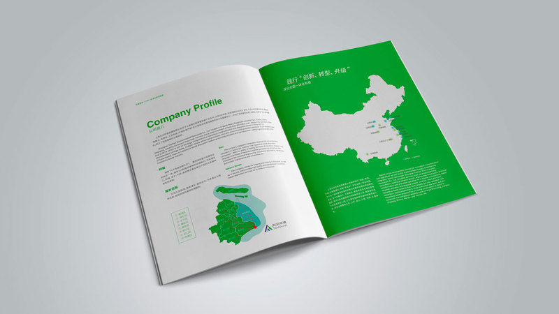
Selection of basic elements for new energy enterprise brochure design

There are mainly three basic elements involved in the design of new energy enterprise brochures. One is text, the other is pictures, and the third is color. These three basic elements may seem simple, but there are indeed many in actual selection. There are many techniques and ideas in it. If these three basic elements can be properly selected and laid out properly, then this picture album will be able to show very good results. Let’s analyze how to determine these three elements when making this picture album. .
In the specific process of designing brochures for new energy companies, the first important element is text. This is a very important part. This brochure is finished. There are a lot of texts to indicate that these texts must be readable. At the same time, the text The font and color of the text, as well as the size of the text, must be taken into consideration. People's visual experience when reading must be fully taken into account, and the visual experience presented by the text should be as easy to accept as possible. Then everyone will feel more comfortable when reading this text. If the text is too small, or if the color of the text is too light, it will not be conducive to reading.
Then the second element is pictures. I believe everyone is more interested in this, because the pictures in this album have a good visual impact, and the pictures may attract readers more easily. Continue reading this content. Therefore, when choosing pictures, try to choose pictures with greater text relevance, or try to choose pictures that better present the characteristics of the company. Then this company may have some products, or some services, etc. These things can also be photographed, or made into pictures, and then placed in this picture album, explained with words, and attracted through these pictures. to the user.
In addition to taking into account pictures when designing new energy enterprise brochures, the third important element is color. When making this brochure, if the color is chosen appropriately, it can have a good impact, and different colors can have a strong impact on people. It has some impact on people's emotions, so when choosing colors, try to choose colors that can have a positive impact on people's emotions. After adding these colors, adjust the brightness of the color, adjust the hue and purity of the color. The entire album will look more coordinated and attractive in color.

Leave a comment: